The right word is worth a thousand pictures and that's why quality web typography is a field every designer should be familiar with. We'll teach you typography basics, css tactics, & enough typography terminology to get you rolling.
Typography is a niche of design focused around the technique of arranging words together in an aesthetically appealing manner. Put plainly - It's the union of words and art. As the internet grows in importance, providing striking web typography becomes a larger piece of the puzzle. In this post we'll briefly introduce you to the concepts involved, useful typography terms, and show newcomers how to tailor their typography with CSS. All of these elements make a good web designer better and make decent web designs absolutely stunning!
It could be argued that typography first came about when Gutenberg dropped his first bible, but in a more general sense it existed long before that. Hieroglyphics, handwritten drop-caps, these we're artisan crafts going back thousands of years. While this may not convince you of the importance, it should at least indicate that people derive some sort of pleasure from seeing a little art mixed in with their written word. As humans pushed technology to allow for faster content production, we saw a massive decline in the beauty of the written word. This evolution and decline can be seen pretty clearly if you follow the history of Western Typography. While typewriters do have a minimalist appeal, but that's more novelty then intent.
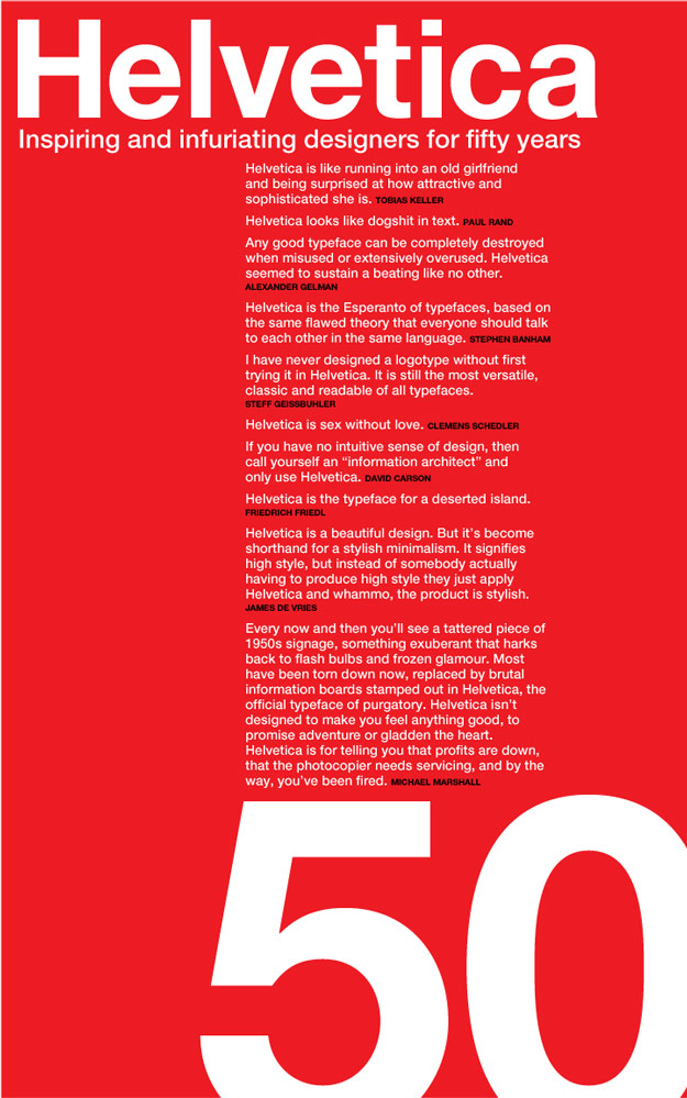
With the growth of graphic design, the public once again found the joys of mixing words and art. One notable standout in the modern era is certainly the Swiss International Style that truly excelled in the mid-1900's. The amazing work of the schools like Bauhaus, played a huge part in reintroducing the general public to the value of well thought out typographic elements. This is when we we're formally introduced to such highly regarded typesets as Helvetica, which still puts a smile on a designers face to this day. With the expansion of the home computer, the general public found that they had the ability to contour type to their liking. In my opinion, the recent rebirth of typography in the design world is in large part a celebration of that.
Typography Terminology
I remember vividly the time I learned that I could adjust letter spacing while creating book reports in Microsoft Word. While that may have just been youthfully tinkering, I later realized that Kerning
was a real thing and that I wasn't the only one in the world who preferred not to see the two T
's touching one another. This illustrates an important point, a large part of dissecting typography terminology is knowing which parts are which. Without getting too deep in the weeds, here are a few of the most important elements you can use to identify specific parts of any given typeface.
- Baseline: The line on which letters rest (either real or imagined).
- Descender: Part of a lowercase letter that hangs below the baseline (y, p, j, etc).
- Kerning: Adjustments relating to the spacing between individual characters.
- Ligature: At least two letters that are tied together into a single glyph. In the word "waffle" the "ffle" need their own unique spacing since they're very similar in appearance.
- Oblique: A slanted version of any typeface. Similar to italic, but Italic is usually preferred.
- Serif: The small strokes at the end of a line. They are usually added to decorative fonts. Sans-serif (without serif) fonts (like arial, helvetica) are generally thought to be easier to read.
- Typeface: A typeface is a collection of fonts. Generally thought of as a "family" of fonts that includes bold, italic, etc.
- Weight: Relative darkness of the characters in a font. Lighter weights are generally suitable for body text, whereas heavy fonts are usually best suited for headline titles.
- White Space: The blank areas of a page. Paying attention to white space helps make text more legible.
Typography in Web Design
While many of the previous elements are defined by the font family, quite a bit can be controlled using CSS. Every designer has a different approach, but here are a few tips we'd suggest when considering how to handle your web typography.
-
General Web Type Tips: You will usually want at least two styles of fonts for your webpage, although Carrie Cousins makes a solid case for using three in this post. Your header font should be bold and convey style, whereas your body text should focus on legibility. There are a few ways to size your text, we'd suggest using the "em" approach since it scales well (and flexibility is trending upwards in importance). Here's an interesting StackOverflow conversation addressing that matter.
-
Basic CSS Elements: To answer
What is Typography
in terms of web design, you need to focus on your CSS styling. The basic elements of web typography are related to size, line-spacing, and color. This sample is good for general body text, the quote sets Helvetica as the primary font family (the following are backups). The size is set to 1em (an average body size) and a line height of 1.3em gives your readers plenty of spacing between lines.p { color: #333333; font-family: 'Helvetica', Arial, sans-serif; font-size: 1em; line-height: 1.2em; } -
Advanced CSS Elements: The more advanced elements of web typography address subtle shadows, letter spacing, font weight, etc. This is a header style that should serve as a good example for the difference usually seen in
"header"
fonts. This css will produce a larger (2em size) Quicksand font in a darker color - notice you can combine those all into one element. The weight adds width and the spacing brings the letters closer together, which creates visual impact. We've included a slight text shadow (one pixel down and right with a tiny grey blur) which will create contrast with the background. Lastly we've uppercased everything and tied it to the baseline.p { color: #222222; font: 2em/1.3em 'Quicksand', Arial, sans-serif; font-weight: 600; letter-spacing: -0.02em; text-shadow: 1px 1px 1px #CCCCCC; text-transform: uppercase; vertical-align: baseline; } -
Including Google Fonts: You can deliver separate font families as needed, but the easiest way to wrap your head around the concept is to try a Google Font into your website. You can select anything in their font library, but to include something simple like a normal and bold
Open Sans
you just need to include this snippet towards the top of your document head (testing has determined the higher you can include it the better). Then you just include the font family into your CSS and you're good to go.<link rel="stylesheet" href="https://fonts.googleapis.com/css?family=Open+Sans:400,700">If you're aiming to provide your own font, just include the different versions (.ttf, .otf, .woff, & .woff2 should cover your bases) and tie the location with @font-face in your CSS. This is obviously a little more difficult, but it runs on the same concept. If you see the font loading slowing your page down, there is an AJAX method described here worth trying. Additionally - If you can't find font family you love at Google, give our previous post on "Free Font Families" or Adobe's Typekit a quick look.
-
Leading Dropcap: There are several ways to create one large letter to start a paragraph, like most people have seen in older script books. When we recently produced the Triangle Ghost Theme, this is the code we used. If you'd like to see how the effect looks, this demo page should give you a good idea.
p.dropcap:first-letter {
	display: block;
	margin: 6px 6px 0px 0px;
	float: left;
	font-size: 280%;
}
Web Typography Trends and Sources of Inspiration
Like any other aspect of design, typography changes along with the times. Below we've included a selection of awesome posts, documentaries, typographic resources, and collections of unadulterated "type-porn"
. These resources combined should help you gather a significantly more advanced perspective on web typography as a whole.
More Typography Resources that Answer "What is Typography"...
Hopefully this post has helped many of you assess your web typography approach and given you the terminology to discuss it accurately. If you have any typography related advice, send them this way and if you've found this post helpful - Please feel free to share with the buttons below.


