Effective typography is halfway between art and science. As it's appreciation in the design community reaches new heights, Jessica Hische is one name that should be piquing your interest.
Solid typography is easy to overlook, because when it's done well it seems effortless. In that same vein, a typographer generally likes to remain "behind the scenes" and let their work speak for itself. Like any craft there is a certain balance that must be struck and Jessica Hische has done an impeccable job so far in her career of making incredible work and supporting her community (without even becoming the least bit art-snobby).
Delving Into Typography
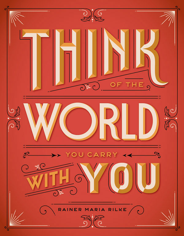
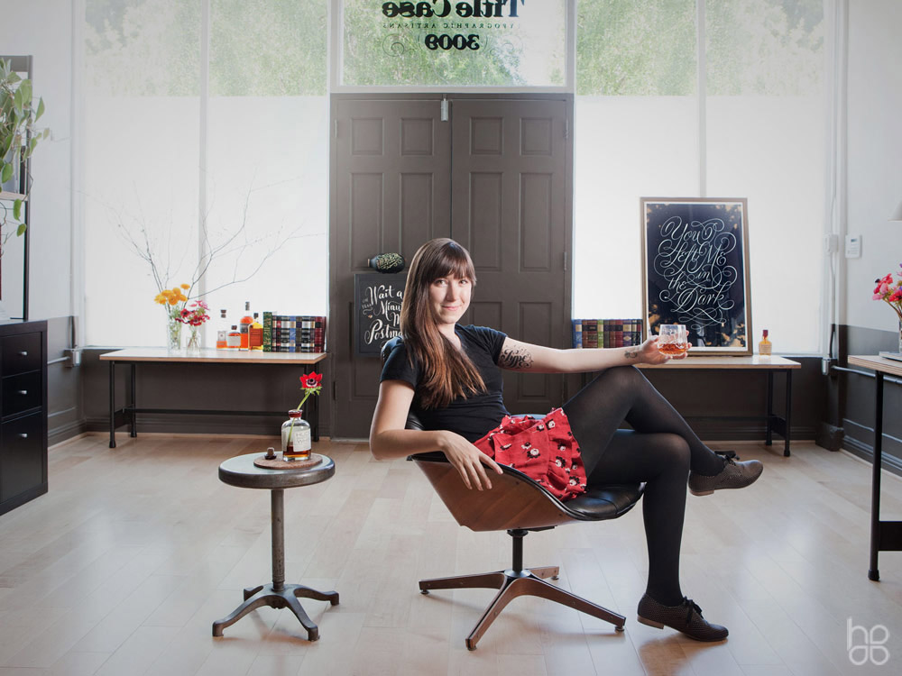
The field of typography is one design niche that is currently undergoing a groundswell of appreciation. One undisputed leader pushing this focus on type is an unassuming young woman from "Nowheresville, Pennsylvania" named Jessica Hische. Besides her fundamental understanding of the field, she also brings her own quirkiness, originality, and sense of humor to her work. The result is an original approach to a timeless challenge - Giving words the ability to communicate both thoughts and emotions.
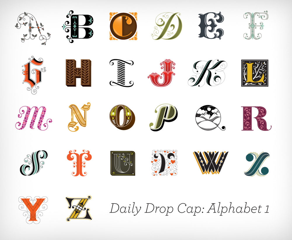
You may have seen her work in the latest Wes Anderson flick or national American Express campaign, but in reality she has placed much more focus on furthering her field then she has her own career. Jessica began receiving major exposure through an awesome project named Daily Drop Cap in which she created a new illustrative letter daily. Eventually she worked through the alphabet a total of twelve times and wrapped it up with one more incredible run featuring guest contributors.
To be honest, her client list is starting to get a little ridiculous, but let's toss a couple names out there so you see the exact caliber of clients she's working with...
MailChimp, Wes Anderson, Tiffany & Co., The New York Times, Penguin Books, Target, Leo Burnett, American Express, and Wired Magazine.
Besides working with an amazing array of clients who appreciate her work, she's also picked up a few industry awards worth noting. Forbes has listed her twice as a "30 under 30" in Art and Design, ADC has titled her a "Young Gun", STEP Magazine has designated her as one of "25 Emerging Artists", and she also serves on the Type Directors Club Board of Directors. In my opinion one of the most engaging aspects of Jessica's work is that she seems to have found her passion at such a young age. Typography has never really been a young persons game, much like architecture it usually requires years of foundation before a typographer can really find their own style... or really allowed to for that matter. However you personally feel about her style, I think any educated designer will admit that she has "done her time" and now moved onto the stage where she can be more expressive and a little pickier about her projects. This is the stage I find most exciting and it's really a gift that we all get to watch this develop in it's entirety. The reality is - whether you're paying attention or not, you will see her work.
Following Jessica Hische's Progress
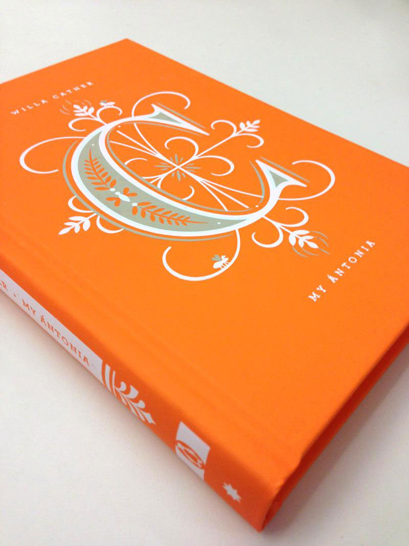
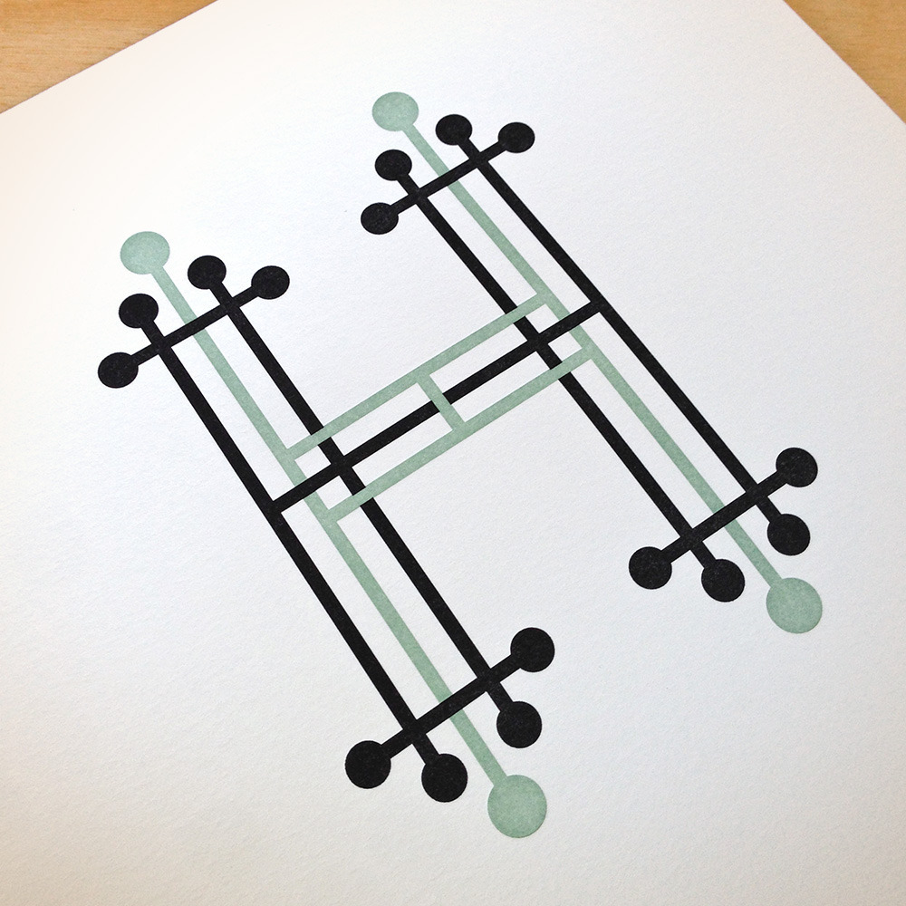
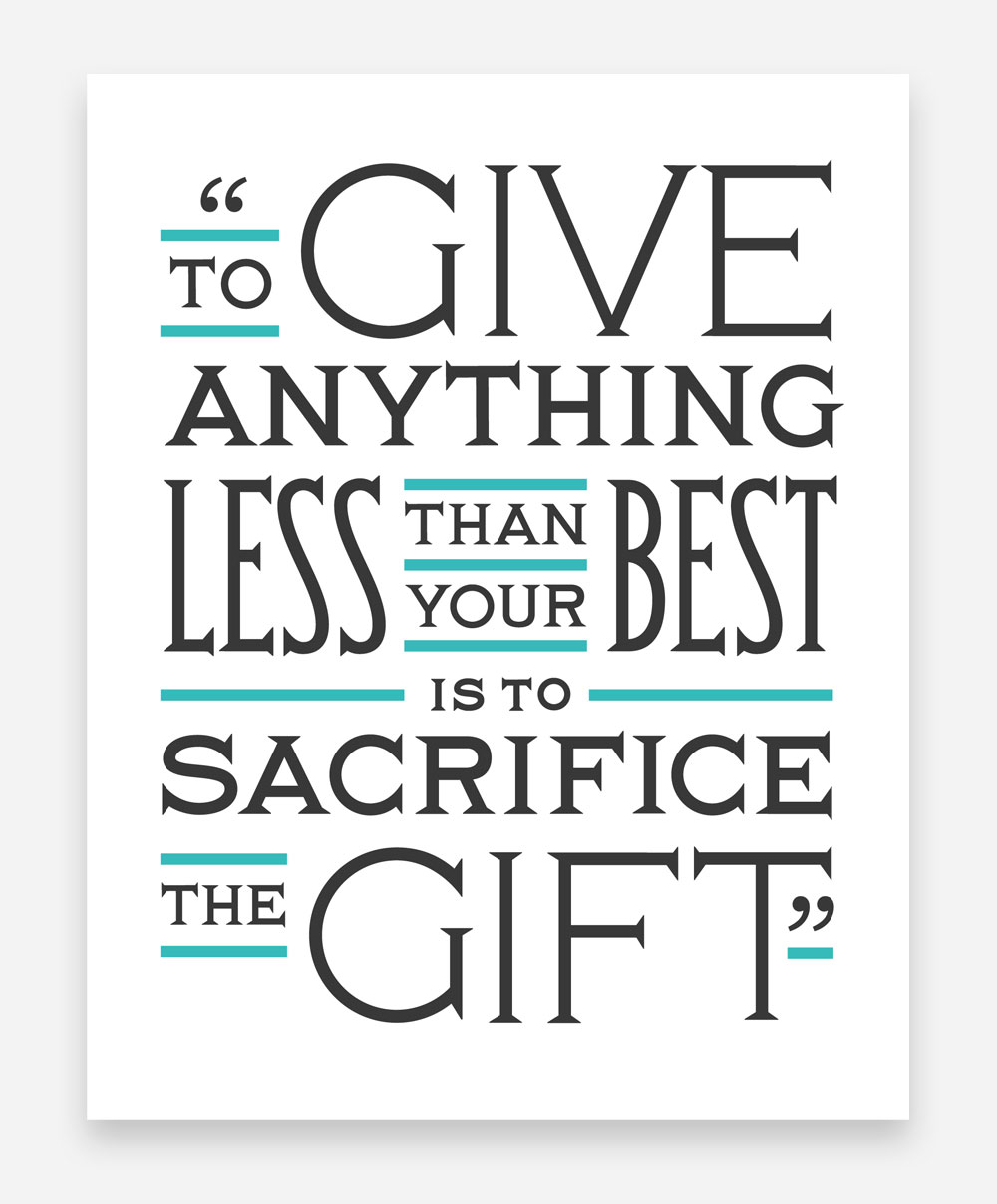
Capturing the breadth of her work can't really be done in a single blog post. I've included a few samples below that hint at the style and comprehension she possesses, but to get a more advanced understanding of her work you should drop by her portfolio at https://jessicahische.is/working. If you're new to the whole typography game, I'd recommend checking out this quick little typography infographic she created. It does a great job of explaining the basic terminology you should know to speak intelligently on the subject. If you like what you see you should give her a follow on Twitter and make sure to keep your eyes peeled for her name on future work. It's an exciting time in the field of typography and to be frank, Jessica is one of the reasons why that is.
